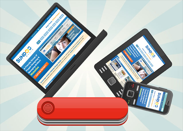
Technology is changing and it’s time for Sundog Media and your website to Respond!

Well obviously we can’t just sit back, do nothing, and go on with a business as usual approach – we need to respond to this! And respond we shall, because we’ve added yet another tool to our Swiss army knife of talents – Responsive Website Design.
That’s right, it’s called, Responsive Website Design, and if you haven’t heard that buzzword yet, you soon shall, because it’s the way websites are going to be built from now on.
In a nutshell, Responsive Web Design is all about how your website will automatically respond to your visitors internet browsing technology. For instance, if someone visits your website via their iPhone, your site will respond to that device, and automatically configure itself to present your website in the best possible way. Same thing will happen if they use a tablet, an e-reader, a gaming device, etc.
Sure, we could dazzle you with geeky-internet-tech-speak about how it all works and how we will be creating responsive websites with flexible grids, layouts, media queries and the like, but that would spoil the magic and probably bore you to tears. Because ultimately it’s not really about the ‘how’s‘ it’s about the results and how your website will automatically respond with your users.
Do you already have a website? Wanna see what it looks like in a variety of different device sizes? Then, take the Responsive Design Test!
We are offering Responsive Website Design options within our new design proposals! If you already have a website with us, please don’t hesitate to ask us about how we can make it more responsive!
If you would like to know more, or if you have any question or comments about Responsive Web Design, please don’t hesitate to contact us!


